
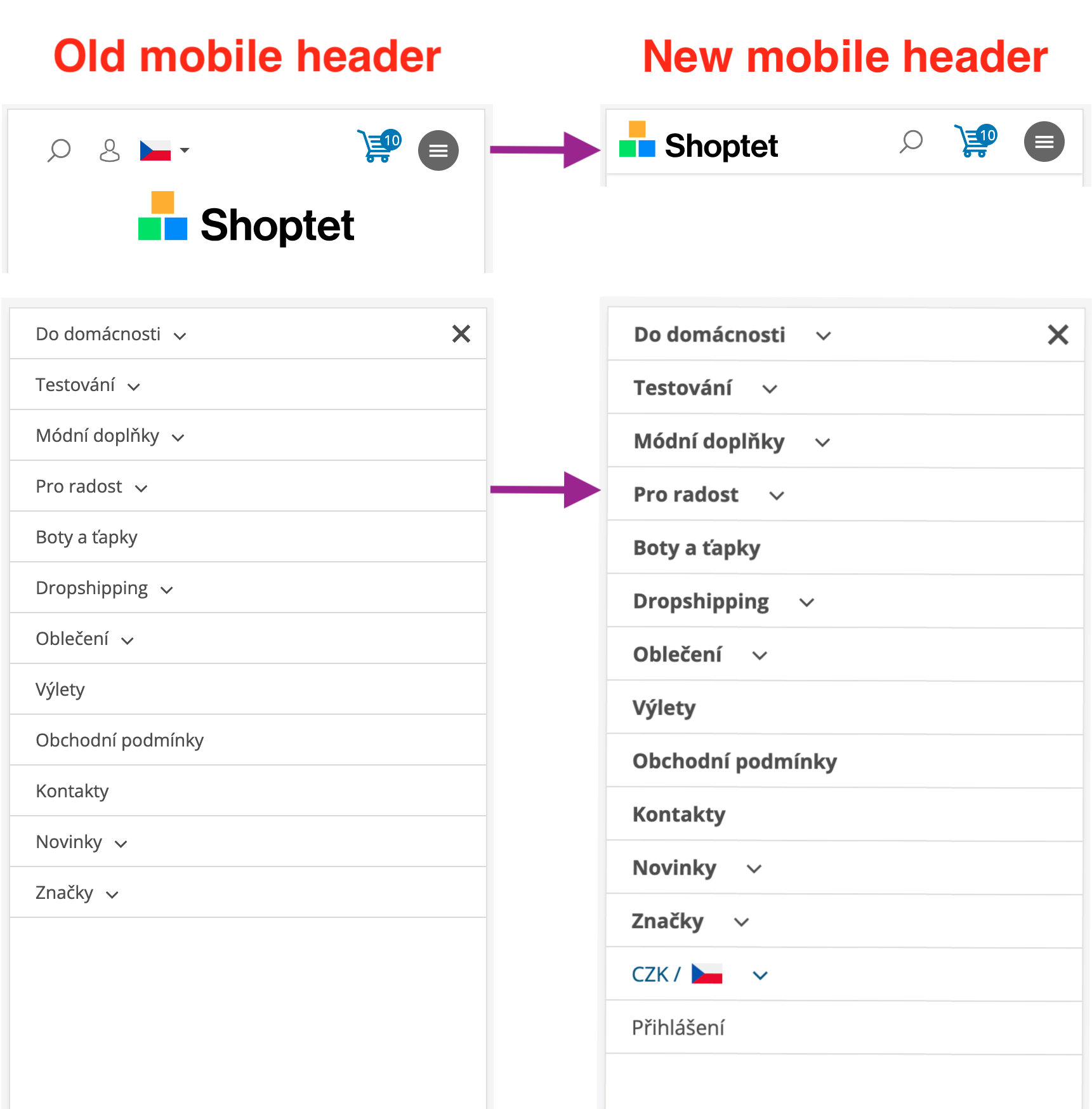
We have removed the legacy mobile header from the templates. After this update, all e-shops using 3G templates will use the same, newer mobile header. This unifies the mobile header across e-shops and allows us to make easier accessibility adjustments and remove the legacy code in the future.
This change applies to all 3G templates and is controlled via UMS.
Update management preview key: mobile_header_v1
The change is scheduled for release on August 04, 2026. If you are an addon developer, please review the changes described below now and adjust your addons accordingly. On the release date, these improvements will be rolled out to the majority of customers. E-shops using Deferred Template Updates will have time until August 18, 2026 to modify their customizations and accept the update.
You can preview the changes by running the command shoptet.helpers.enableUpdatePreview('mobile_header_v1') in the browser console.
To check which mobile header your e-shop uses, run shoptet.config.mobileHeaderVersion in the browser console on your storefront — 0 means the legacy header, 1 the new one.
E-shops that already use the new mobile header will not see this update in the Deferred Template Updates list, and the update cannot be deferred for them. Their visual appearance remains the same as before.
The mobile-header-version-0 and mobile-header-version-1 classes will no longer be added to the element after August 18, 2026. If you rely on custom CSS or JavaScript targeting these classes, please update your selectors and no longer use these classes.
This applies to e-shops coming from the legacy mobile header. The navigation now renders a new .navigationActions list inside the .navigation-in container, directly after the main .menu-level-1 menu. The list is visible only in the mobile (hamburger) menu, on desktop resolutions it is hidden.
The list contains:
li.ext) with a .navigationActions__submenu.menu-level-2 submenu listing all currencies and languages.Example structure:
<div class="navigation-in menu">
    <ul class="menu-level-1" role="menubar">…</ul>
    <ul class="navigationActions" role="menu">
        <li class="ext" role="none">
            <a href="#">
                <span class="navigationActions__flagWrapper">
                    <span>CZK /</span>
                    <svg class="shp-flag shp-flag-CZ navigationActions__flag navigationActions__flag-right">
                        <use xlink:href="#shp-flag-CZ"></use>
                    </svg>
                </span>
                <span class="submenu-arrow"></span>
            </a>
            <ul class="navigationActions__submenu menu-level-2" role="menu">
                <li role="none">
                    <ul role="menu">
                        <li class="navigationActions__submenu__item navigationActions__submenu__item--active" role="none">
                            <a href="/action/Currency/changeCurrency/?currencyCode=CZK" rel="nofollow" role="menuitem">CZK</a>
                        </li>
                        <li class="navigationActions__submenu__item" role="none">
                            <a href="/action/Currency/changeCurrency/?currencyCode=EUR" rel="nofollow" role="menuitem">EUR</a>
                        </li>
                    </ul>
                    <ul role="menu">
                        <li class="navigationActions__submenu__item navigationActions__submenu__item--active" role="none">
                            <a href="/action/Language/changeLanguage/?language=cs" class="navigationActions__link--flag" rel="nofollow" role="menuitem">
                                <span class="navigationActions__flagWrapper">
                                    <svg class="shp-flag shp-flag-CZ navigationActions__flag navigationActions__flag-left">
                                        <use xlink:href="#shp-flag-CZ"></use>
                                    </svg>
                                    <span>Čeština</span>
                                </span>
                            </a>
                        </li>
                        <li class="navigationActions__submenu__item" role="none">
                            <a href="/action/Language/changeLanguage/?language=sk" class="navigationActions__link--flag" rel="nofollow" role="menuitem">
                                <span class="navigationActions__flagWrapper">
                                    <svg class="shp-flag shp-flag-SK navigationActions__flag navigationActions__flag-left">
                                        <use xlink:href="#shp-flag-SK"></use>
                                    </svg>
                                    <span>Slovenčina</span>
                                </span>
                            </a>
                        </li>
                    </ul>
                </li>
            </ul>
        </li>
        <li role="none">
            <a href="/prihlaseni/" rel="nofollow" role="menuitem"><span>Přihlášení</span></a>
        </li>
    </ul>
</div>
On mobile, the header of these templates is newly fixed to the top of the screen. It hides when the user scrolls down and appears again when the user scrolls up.
On mobile, the following header elements are hidden in the new header. These actions are available in the navigation menu instead. Hiding the .languagesMenu element also hides its .languagesMenu__flags toggle button with the language flags. Hidden elements per template:
.top-nav-login, .top-nav-currency (contains the currency dropdown or the .languagesMenu).top-nav-button-login, .languagesMenu in .navigation-buttonsa[data-target='login'] in .responsive-tools, .languagesMenu in .top-navigation-tools.top-nav-button-login, a.top-nav-button-account, .languagesMenu in .navigation-buttons.top-nav-button-login, a.top-nav-button-accountshoptet.config.mobileHeaderVersion returns the value corresponding to the active mobile header version only until the update is rolled out to all e-shops on August 18, 2026. After this date, the property will be removed from shoptet.config completely and there will be only one version of the mobile header. If your addon reads this value, please remove the code that depends on it.