
We updated the stars component, the simple rating flow, and the tabs used for discussions and advanced rating. The main goal is to improve accessibility and unify the markup and behavior of the stars component.
This change applies to all 3G templates and is controlled via UMS.
Update management preview key: discussion_rating_forms
The change is scheduled for release on April 27, 2026. If you are an addon developer, please review the changes described below now and adjust your addons accordingly. On the release date, these improvements will be rolled out to the majority of customers. E-shops using Deferred Template Updates will have time until May 11, 2026 to modify their customizations and accept the update.
You can preview the changes by running the command shoptet.helpers.enableUpdatePreview('discussion_rating_forms') in the browser console.
A <h2>Discussion</h2> heading is added inside the discussion wrapper.
The “Add a comment” trigger is now a native <button>.
<button type="button" class="btn btn-sm btn-secondary" aria-expanded="false" aria-controls="discussion-form">Add a comment</button>
A form legend with “Required fields” text is added at the top of the form.
<p class="form-legend" aria-hidden="true"><span class="required-asterisk required-asterisk--before">Required fields</span></p>
The form uses novalidate attribute. All form inputs now have proper <label> elements associated via for/id. The placeholder attributes are removed. Each label/input pair is wrapped in .form-group.smart-label-wrapper. New native required attributes are now used on inputs.
<div class="form-group js-validated-element-wrapper smart-label-wrapper">
  <label for="email"><span class="required-asterisk">E-mail</span></label>
  <input type="email" name="email" value="user@example.com" id="email" class="form-control js-validate-required" required>
</div>
The <input type="submit"> is replaced with a <button type="submit">.
<button type="submit" class="btn btn-sm btn-primary">Send comment</button>
The reply button uses btn-secondary class instead of btn-primary.
Styling of this section has changed. If you rely on custom CSS, review and update your overrides accordingly.
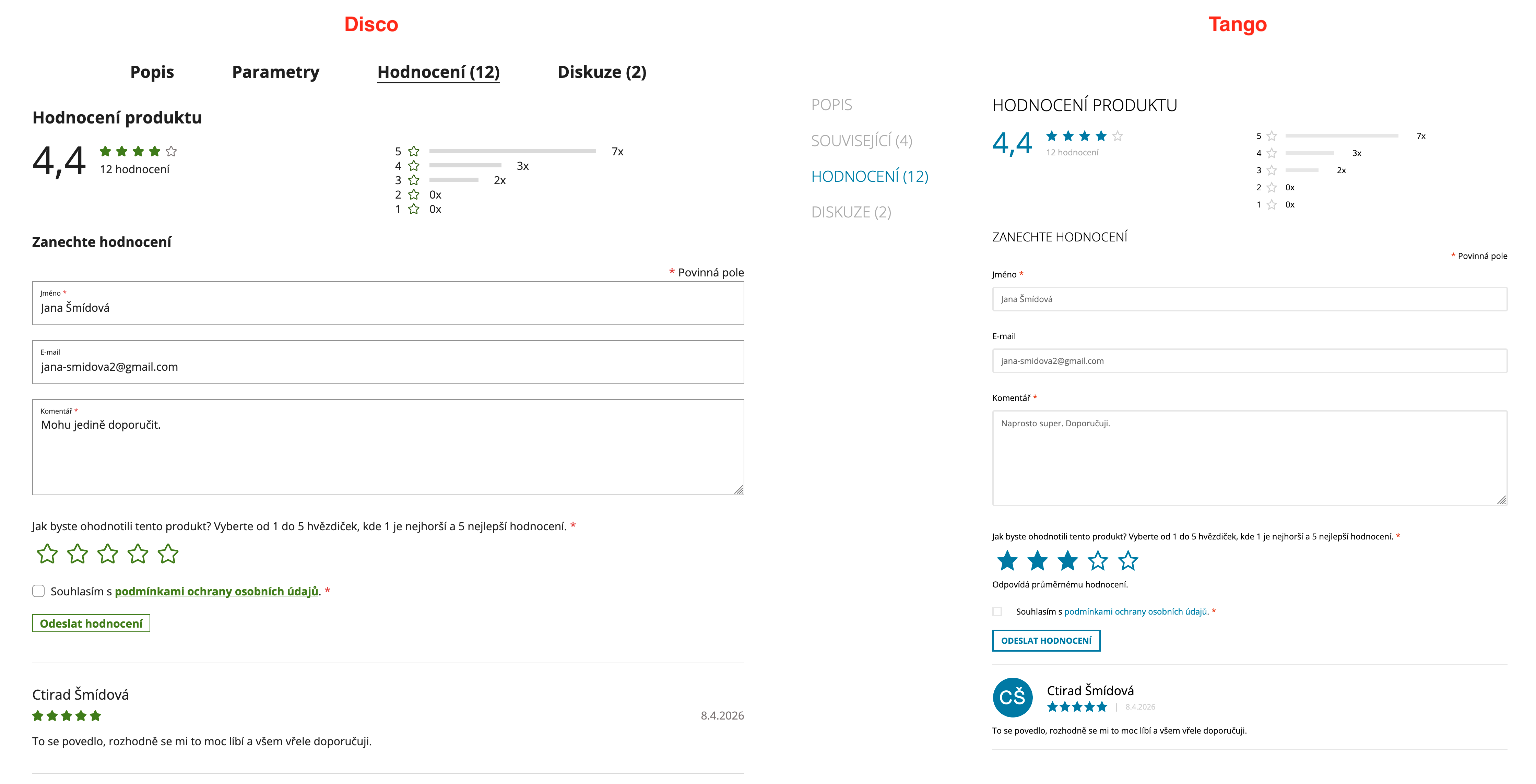
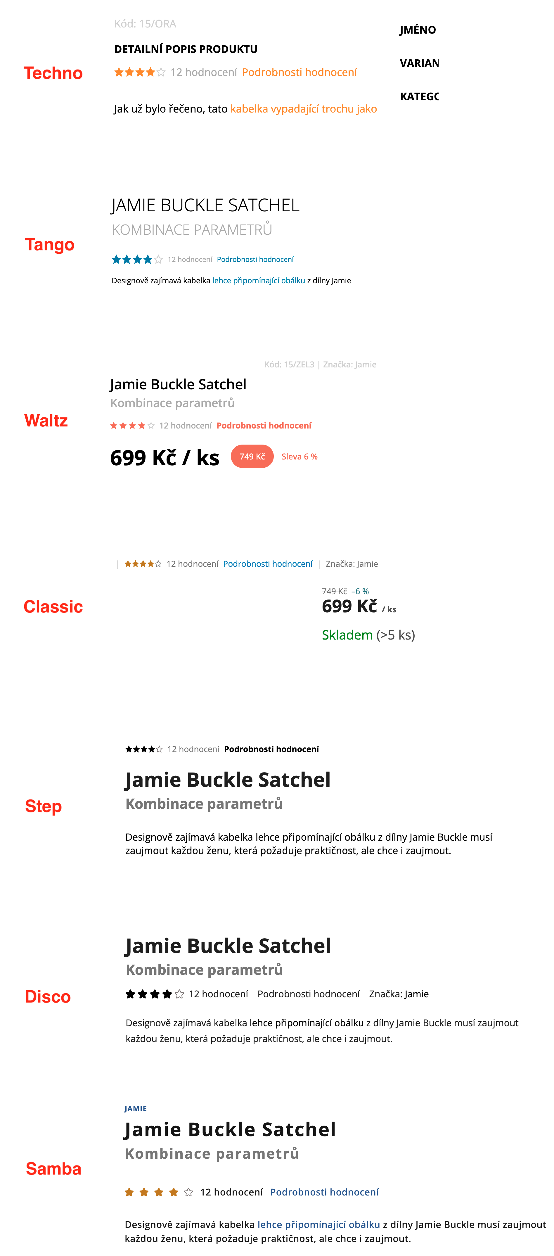
A new “Rating details” link is added next to the stars on the product detail page. It scrolls to and activates the rating tab.
<a class="stars-link show-ratings" href="#ratingTab" data-toggle="tab">Rating details</a>
A <h2>Product rating</h2> heading is added inside the rating tab. When the product has been rated before, a <h3>Leave a rating</h3> heading is also shown above the form.
The Bootstrap grid structure (row, col-*) is removed.
The “Add a rating” trigger is now a native <button>.
<button type="button" class="btn btn-sm btn-secondary" aria-expanded="false" aria-controls="rate-form">Add a rating</button>
Stars are now a radio button group with proper ARIA attributes. The value is no longer preselected — instead of the previous default of 5 stars, no option is selected by default. A preselected value is applied only when the user arrives via an email link.
<div class="form-group rating-stars-group js-validated-element-wrapper">
    <p id="rating-stars-label" class="label rating-stars-description"><span class="required-asterisk">Jak byste ohodnotili tento produkt? Vyberte od 1 do 5 hvězdiček, kde 1 je nejhorší a 5 nejlepší hodnocení.</span></p>
    <div class="rating-stars-wrapper" aria-labelledby="rating-stars-label" role="radiogroup" data-testid="wrapperRatingStars">
        <label class="rating-star full">
            <input type="radio" name="score" value="1" aria-label="Add your rating: 1" aria-describedby="rating-star-description-1" required="">
        </label>
        <!-- … 2–5 … -->
    </div>
    <p id="rating-star-description-1" class="rating-star-description" hidden="hidden">Odpovídá velmi negativnímu hodnocení.</p>
    <!-- … descriptions for 2–5 … -->
</div>
The form uses novalidate attribute. All inputs now have proper <label> elements instead of placeholder attributes. Each label/input pair is wrapped in .form-group.smart-label-wrapper. New native required attributes are used on inputs.
The <input type="submit"> is replaced with a <button type="submit">.
Styling of this section has changed. If you rely on custom CSS, review and update your overrides accordingly.
The legacy star interaction in products.js (jQuery click/hover on star elements, preselecting stars from URL) is no longer used. Star preselection from email links is handled by the new module which works with radio inputs.
Similar changes as in Advanced rating were applied to the stars component and the form in store rating.
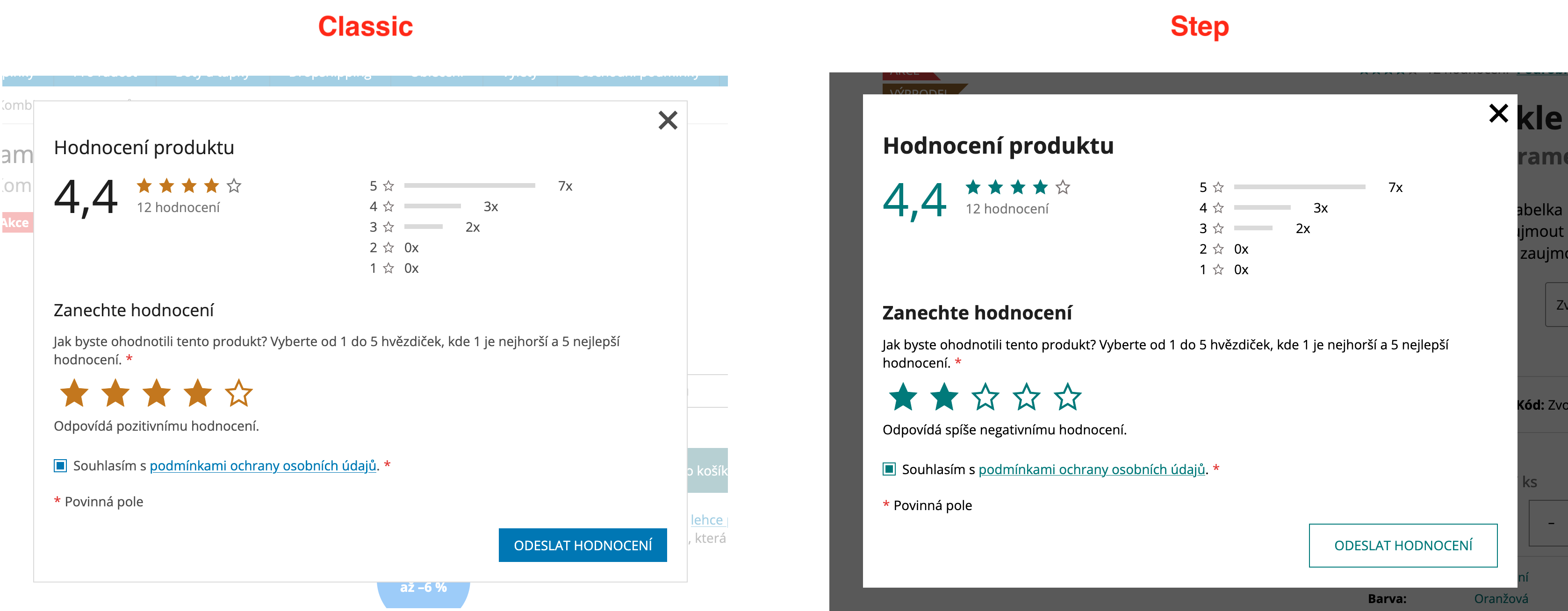
When “Advanced rating with discussion” is not enabled in administration, a “Rating details” button appears next to the product stars on the product detail page. Clicking it opens a modal dialog for star-only rating.
<button type="button"
  class="btn btn--link js-ratingDialogTrigger"
  data-simple-rating="{RATING_SUBPAGE_URL}"
  data-product-id="{PRODUCT_ID}"
  aria-haspopup="dialog">
  Rating details
</button>
The modal content is loaded via AJAX. It shows rating statistics (if the product has been rated before) and the rating form. The structure reuses the same components as the advanced rating — rate bars and the radio-button star selection. The modal uses the Colorbox module, consistent with the rest of the website.
New components were introduced in this section, including the modal content. If you rely on custom CSS, review and update your styles accordingly.
A new JavaScript module handles the modal opening, form initialization, and rating submission via AJAX. After successful submission, rating summaries on the page are replaced with updated data from the response without a full page reload. When a customer arrives from a rating email link (URL contains #ratingWrapper with guid and preselectStars parameters), the modal opens automatically with stars preselected.
Stars are now consistently implemented as <span> elements across the storefront.
On the product detail page, stars were changed from <a> links with tooltips to <span> elements. In addition, the stars container now uses the classes .star-list and .stars--productDetail.
Stars in product listings (category pages, manufacturer pages, related products), latest ratings widget (homepage, sidebar, footer), review rows, and store rating stars were already rendered as <span> elements. They now have aria-hidden="true" on each star icon, and a .sr-only span provides the meaning for screen readers.
<span class="stars">
  <span class="star star-on" aria-hidden="true"></span>
  <span class="star star-on" aria-hidden="true"></span>
  <span class="star star-on" aria-hidden="true"></span>
  <span class="star star-on" aria-hidden="true"></span>
  <span class="star star-off" aria-hidden="true"></span>
  <span class="sr-only">The product rating is 4 out of 5 stars.</span>
</span>
The screen reader text differs by context — for a single rating: “The product rating is X out of 5 stars”, for an average: “The average product rating is X out of 5 stars”, and for store ratings: “The store rating is X out of 5 stars”.
Star layout uses flexbox with gap instead of float-based positioning. The visual appearance remains the same.
We updated the heading hierarchy on the homepage, cart, and checkout pages. The main goal is to
ensure each page has exactly one <h1> element and a proper heading structure for better SEO and
accessibility.
This change applies to all 3G templates and is controlled via UMS.
Update management preview key: homepage_cart_checkout_headings
The change is scheduled for release on April 22, 2026. If you are an addon developer, please review the changes described below now and adjust your addons accordingly. On the release date, these improvements will be rolled out to the majority of customers. E-shops using Deferred Template Updates will have time until May 6, 2026 to modify their customizations and accept the update.
You can preview the changes by running the command shoptet.helpers.enableUpdatePreview('homepage_cart_checkout_headings') in the browser console.
There are no visual changes — all modifications are purely semantic. Existing heading styles are preserved using CSS classes (.h1, .h4).
Previously, the <h1> was placed either on the logo/site name or on the welcome text (“Uvítací
text”), depending on which was present. Now, a single <h1> with the page title is placed at the top
of the main content area as a screen-reader-only element.
<main id="content">
     <h1 class="sr-only">{page title}</h1>
     …
 </main>
The site name wrapper is now always rendered as a <div> instead of conditionally using
<h1> on the homepage.
<!-- Before -->
<h1 class="site-name">…</h1>

<!-- After -->
<div class="site-name">…</div>
When the welcome text (“Uvítací text”) is present, it is now rendered as a <div> with the .h1 CSS class instead of an <h1> element.
<!-- Before -->
<h1 data-testid="eshopHeader">Welcome text</h1>

<!-- After -->
<div class="h1" data-testid="eshopHeader">Welcome text</div>
A screen-reader-only <h1> with the page title is added at the top of the main content area, same as on the homepage.
Section headings in the cart (“Extras and discounts”, “Extras”, “Order summary”, “Do you need help?”) are changed from <h4> to <h2>. Visual appearance is preserved using the .h4 CSS class.
<!-- Before -->
<h4>Extras and discounts</h4>

<!-- After -->
<h2 class="h4">Extras and discounts</h2>
The cart widget overlay (#cart-widget) now contains a screen-reader-only heading and is labeled with
aria-labelledby for proper accessibility.
<div id="cart-widget" class="content-window cart-window" role="dialog" aria-hidden="true"
 aria-labelledby="cartHeading">
     <h2 id="cartHeading" class="sr-only">Cart</h2>
     …
 </div>
A screen-reader-only <h1> with the page title is added at the top of the main content area, same as on the homepage and cart.
“Order summary” and “Do you need help?” headings are changed from <h4> to <h2 class="h4">, same as in the cart.
Styles have been updated across all 3G templates to ensure that <h2> elements with the .h4 class and <div> elements with the .h1 class render identically to their previous heading counterparts. If you rely on custom CSS targeting these heading elements by tag name, review and update your selectors accordingly.