
The Bestsellers section and product sorting controls on category pages were improved for better keyboard and screen reader accessibility. Both components now use semantic HTML elements, proper aria attributes, and clear focus management to ensure predictable navigation and announcements for assistive technologies.
This change affects all 3G templates.
Update management preview key: a11y_category_page
The change is scheduled for release on November 12, 2025. If you are an addon developer, please review the changes described below now and adjust your addons accordingly. On the release date, these improvements will be rolled out to the majority of customers. E-shops using Deferred Template Updates will have time until November 26, 2025 to modify their customizations and accept the update.
You can preview the changes by running the command shoptet.helpers.enableUpdatePreview('a11y_category_page') in the browser console.
<div class="products-top-wrapper has-inactive" aria-labelledby="productsTopHeading">
  <h2 id="productsTopHeading" class="products-top-header">Nejprodávanější</h2>

  <div id="productsTop" class="products products-inline products-top">
    <!-- Visible product -->
    <div class="product active" aria-hidden="false">
      <div class="p" data-micro="product">
        <!-- Image link skipped in tab order -->
        <a href="{URL}" class="image" aria-hidden="true" tabindex="-1">
          <img src="{URL}" alt="{ALT_DESCRIPTION}" width="100" height="100" loading="lazy" />
          <!-- …meta, etc. without changes -->
        </a>

        <div class="p-in">
          <div class="p-in-in">
            <!-- Name link focusable (active item) -->
            <a href="{URL}" class="name" data-micro="url">
              <span data-testid="productCardName">Betula - březový stůl</span>
            </a>
            <!-- …availability without changes -->
          </div>
          <!-- …price without changes -->
        </div>
      </div>
    </div>

    <!-- Hidden product -->
    <div class="product inactive" aria-hidden="true">
      <div class="p" data-micro="product">
        <a href="{URL}" class="image" aria-hidden="true" tabindex="-1">
          <img src="{URL}" alt="{ALT_DESCRIPTION}" width="100" height="100" loading="lazy" />
        </a>

        <div class="p-in">
          <div class="p-in-in">
            <!-- Name link removed from tab order while hidden -->
            <a href="{URL}/" class="name" data-micro="url" tabindex="-1">
              <span>Silikonová klávesnice - černá</span>
            </a>
            <!-- … -->
          </div>
          <!-- … -->
        </div>
      </div>
    </div>
  </div>

  <div class="button-wrapper">
    <button class="chevron-after chevron-down-after toggle-top-products btn" type="button" aria-expanded="false" aria-controls="productsTop" data-label-show="Zobrazit více produktů" data-label-hide="Zobrazit méně produktů">
      Zobrazit více produktů
    </button>
  </div>
</div>
.products-top-wrapper groups items and the toggle button and the attribute aria-labelledby connects to the hidden <h2>. The class .has-inactive on the wrapper indicates there are hidden items. and .has-revealed indicates that products have been revealed.
.button-wrapper has been removed from the product listing and moved behind it. The toggle button is now a native <button> with aria-controls="productsTop" and aria-expanded toggled by JS. This button is now also displayed on screens smaller than 1200px.
.active and later .revealed → aria-hidden="false"; name links are focusable.
.inactive → aria-hidden="true"; both image links and name links have tabindex="-1" so they’re skipped by keyboard and screen readers.
The CSS for the toggle button was adjusted to match the new semantic <button> element, but its visual appearance remains unchanged compared to the previous version.
Scripts handling the Bestsellers section were updated for accessibility and focus management
When users expand the section, newly revealed products become focusable and the focus moves to the first newly shown product. When the section is collapsed again, focus returns to the toggle button.
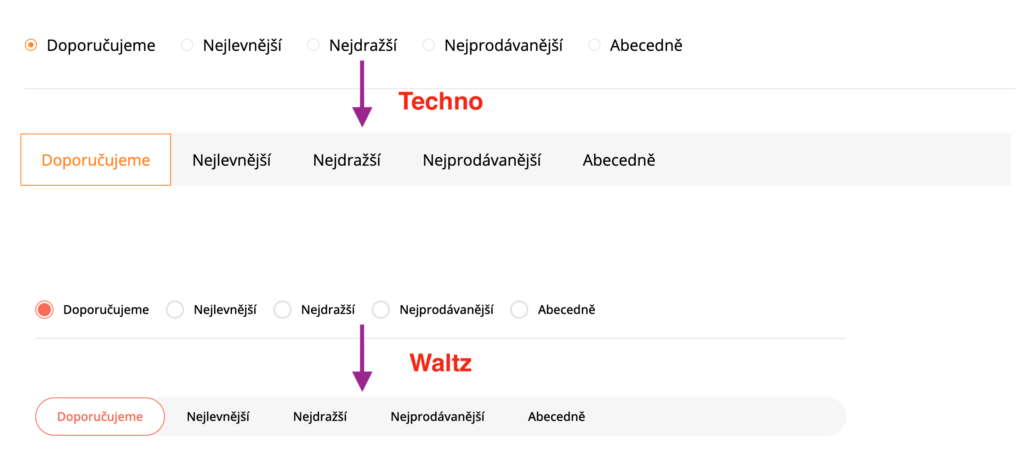
The HTML structure of the product sorting component on category pages was completely revised to improve accessibility and keyboard interaction. All supporting JavaScript has been modified, and the sorting controls were visually redesigned for Techno and Waltz templates.
<div class="listSorting js-listSorting">
  <h2 id="listSortingHeading" class="sr-only">Řazení produktů</h2>
  <ul class="listSorting__controls" aria-labelledby="listSortingHeading">
    <li>
      <button id="listSortingControl-priority" class="listSorting__control listSorting__control--current" type="button" data-sort="priority" data-url="{CATEGORY_URL}/?order=priority" aria-label="Doporučujeme - Aktuálně nastavené řazení" aria-disabled="true">
        Doporučujeme
      </button>
    </li>
    <li>
      <button id="listSortingControl-price" class="listSorting__control" type="button" data-sort="price" data-url="{CATEGORY_URL}/?order=price">Nejlevnější</button>
    </li>
    <!-- … other buttons … -->
  </ul>
</div>

<!-- only for Classic -->
<div class="listItemsTotal"><strong>32</strong> položek celkem</div>
The entire form with radio inputs was replaced by a new wrapper .listSorting. It contains a hidden heading <h2 id="listSortingHeading" class="sr-only">. Sorting options are structured as a list <ul class="listSorting__controls"> with individual <li> items.
Each sorting option is now a <button> with attributes data-sort and data-url. The currently selected option has .listSorting__control--current, aria-disabled="true", and an aria-label describing it as the current sorting.
Buttons replace the previous <input type="radio"> + <label> pair and provide direct keyboard activation (Enter/Space).
The element showing the total number of items was renamed to .listItemsTotal. Its structure and content remain the same.
<div class="listSorting listSorting--dropdown js-listSorting" aria-labelledby="listSortingHeading">
  <h2 id="listSortingHeading" class="sr-only">Řazení produktů</h2>
  <button class="sortingToggle" type="button" aria-haspopup="true" aria-expanded="false" aria-controls="listSortingControls">
    <span class="icon-sort" aria-hidden="true"></span>
    <span class="sortingToggle__label">Řadit podle:</span>
    <span class="sortingToggle__value">Doporučujeme</span>
    <span class="icon-chevron-down" aria-hidden="true"></span>
  </button>
  <div id="listSortingControls" class="listSorting__controls listSorting__controls--dropdown" role="menu" tabindex="-1">
    <button id="listSortingControl-priority" class="listSorting__control listSorting__control--current" type="button" role="menuitem" data-sort="priority" data-url="{CATEGORY_URL}/?order=priority" aria-label="Doporučujeme - Aktuálně nastavené řazení" aria-disabled="true">
      Doporučujeme
    </button>
    <button id="listSortingControl-price" class="listSorting__control" type="button" role="menuitem" data-sort="price" data-url="{CATEGORY_URL}/?order=price">Nejlevnější</button>
    <!-- … other buttons … -->
  </div>
</div>
The entire form was replaced by a new wrapper .listSorting.listSorting--dropdown. It contains a hidden heading <h2 id="listSortingHeading" class="sr-only"> used as an accessible name through aria-labelledby.
A new toggle button .sortingToggle uses aria-controls and aria-expanded, which are dynamically updated by JavaScript. The open state is indicated by the .listSorting--open class on the wrapper.
The dropdown menu is now a <div id="listSortingControls" role="menu"> and each sorting option is a native <button> with role="menuitem", data-sort, and data-url. The currently selected option has .listSorting__control--current just like the templates above.
The CSS for the sorting component was rewritten to support the new structure and interaction states. Although the markup and control elements have changed, the overall visual appearance remains the same across most templates, with only minor differences.
Only Techno and Waltz templates have a completely new design.
The JavaScript for product sorting was completely rewritten and no longer depends on the legacy Bootstrap dropdown scripts. It ensures correct focus handling, and improves screen reader announcements during loading and after sorting.
During loading, the products container is marked with aria-busy="true" and a live announcer informs screen readers that products are being loaded. Once the request is complete, the announcer reports “Products sorted.” and focus returns to the appropriate element — the current sorting button (Techno, Waltz, Classic, Step, Samba) or the dropdown toggle (Tango, Disco).
In the dropdown variant, keyboard navigation now works predictably. The toggle button uses aria-haspopup="true" and dynamically updates aria-expanded while opening and closing the menu. The menu can be opened with Enter, Space, or click, and closed with Escape, by clicking outside, or when tabbing past the last option.
We released new color schemes, which will be compliant when matched with other color tokens.
We unified the radiogroups in the checkout. There were two radiogroups, which were misleading for keyboard users. Also, payments icons are now decorative.
We fixed the bad heading text on the login page, which showed the registration heading.
We fixed the inconsistent appearance of the text wrapping in the infobox on the Samba template.
We fixed the behaviour when Apple Pay is not available in the checkout.
We fixed auto-fill of the delivery address for the logged-in users.
Please note: the above outlook for 14 days is subject to change due to unexpected events or changes in priorities – we do not commit to delivering these outputs and outcomes. Thank you for your understanding.